When I went through the personal injury sites in KC I do what I always do, search the phrase “Kansas City Personal Injury Lawyer”. I then view and catalog every site – in this case going twenty pages deep. This was an exercise I did years ago when I was with FindLaw. To say the design quality has improved would be a massive understatement. There are some beautiful sites in Kansas City! What was also striking was the shakeup on the first page of Google in KC. Prior to 2012 and the various Penguin updates, these firms dominated the first page of Google for KC PI: Sly James, Dempsey Kingsland, Monsees Miller, Dollar Burns, and the McCallister Firm. Today most of those firms are buried deep in the Google results thanks to, in most cases, bad link profiles. Many of those firms would be better off starting over on a new domain.
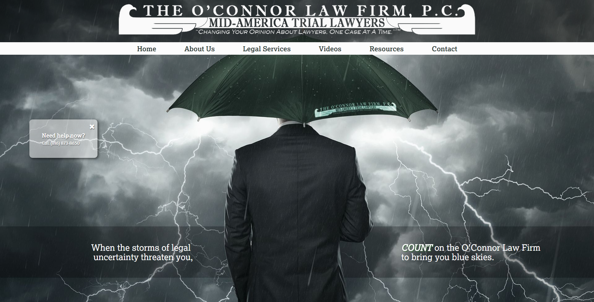
#1. www.ockclaw.com
Very slick looking legal website with some cool interactive features. The homepage includes an interactive question/answer series meant to highlight the lawyer’s unique qualifications. The main umbrella image is very impactful, particularly on an oversized monitor. Did a nice job with responsive design as well. Visibility is good for criminal practice but not for personal injury.
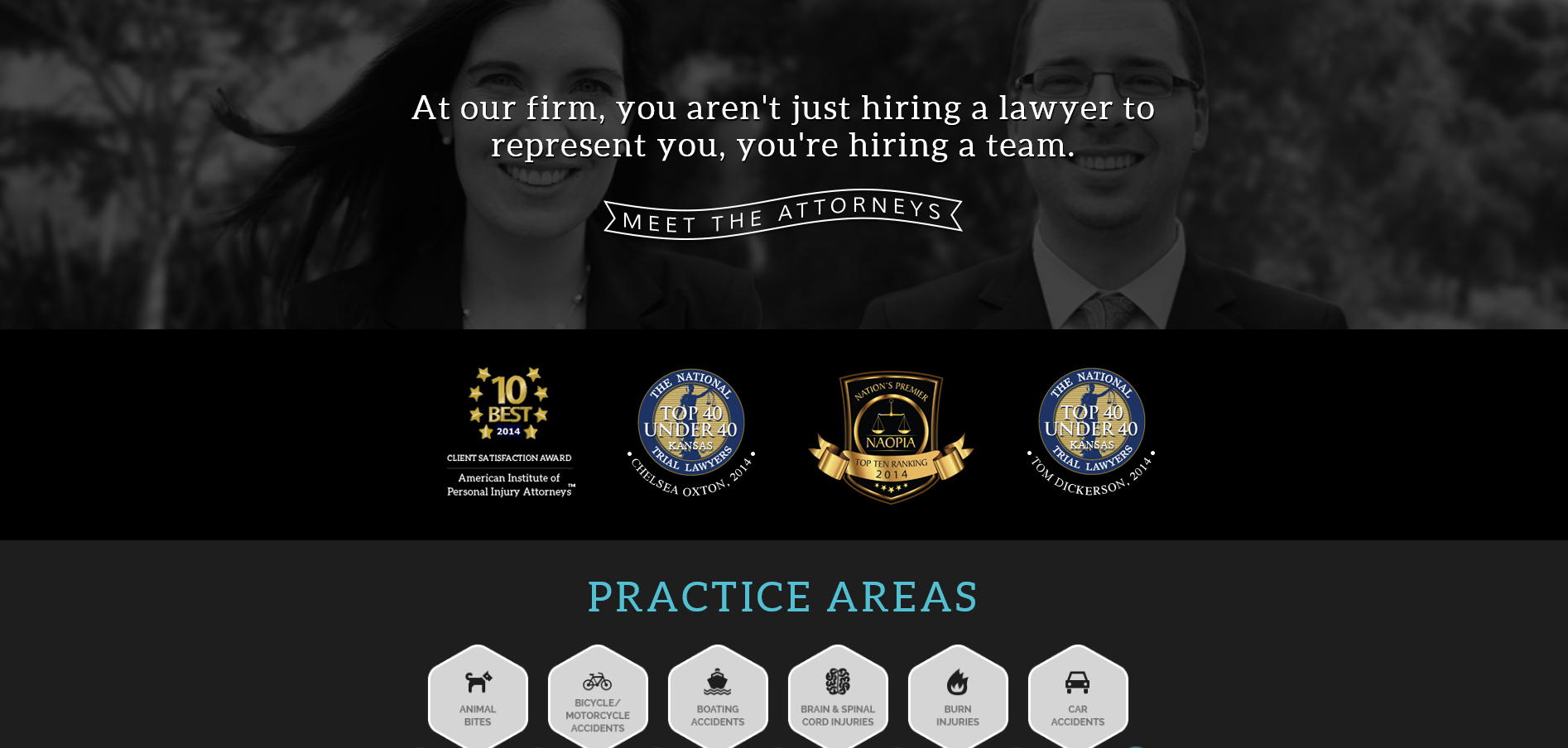
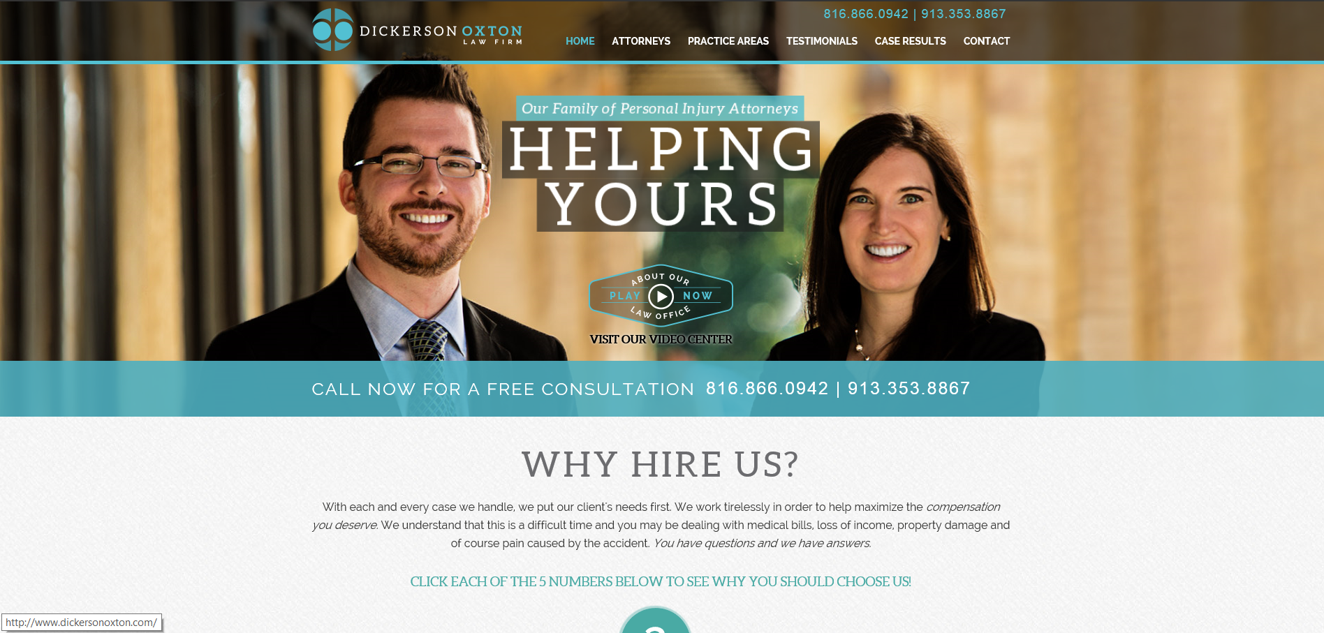
#2 www.dickersonoxton.com
A great looking website that is also one of the most visible personal injury websites in Kansas City. The site features a well produced video and slick video player. When you click on a “request for consultation” button, the site moves down to the contact form – a slick feature. iLawyermarketing has done a great job with SEO as each internal page seems to rank in Kansas City.
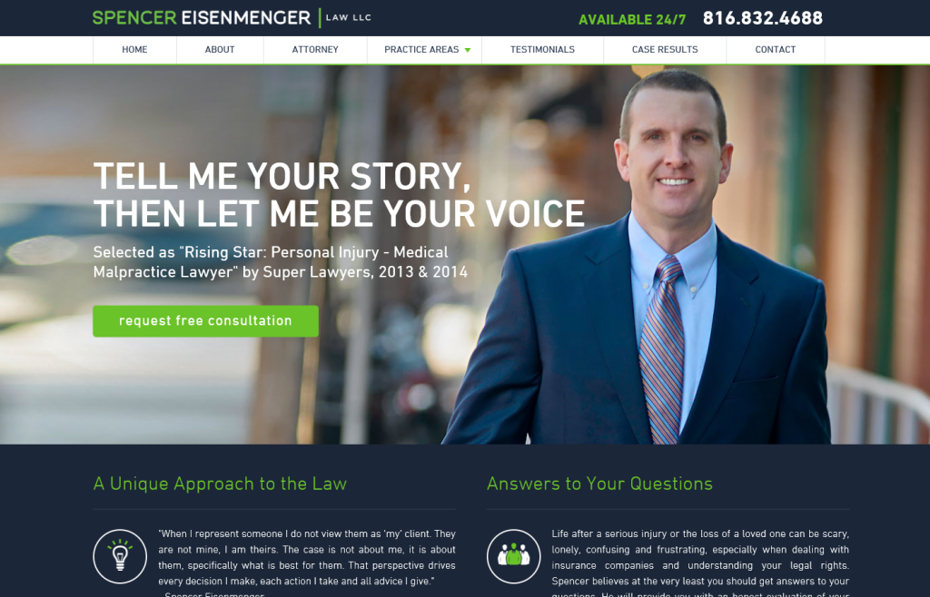
#3. www.spencerkc.com
Fantastic new site released in February 2015. Very clean looking site with great content and a great responsive design
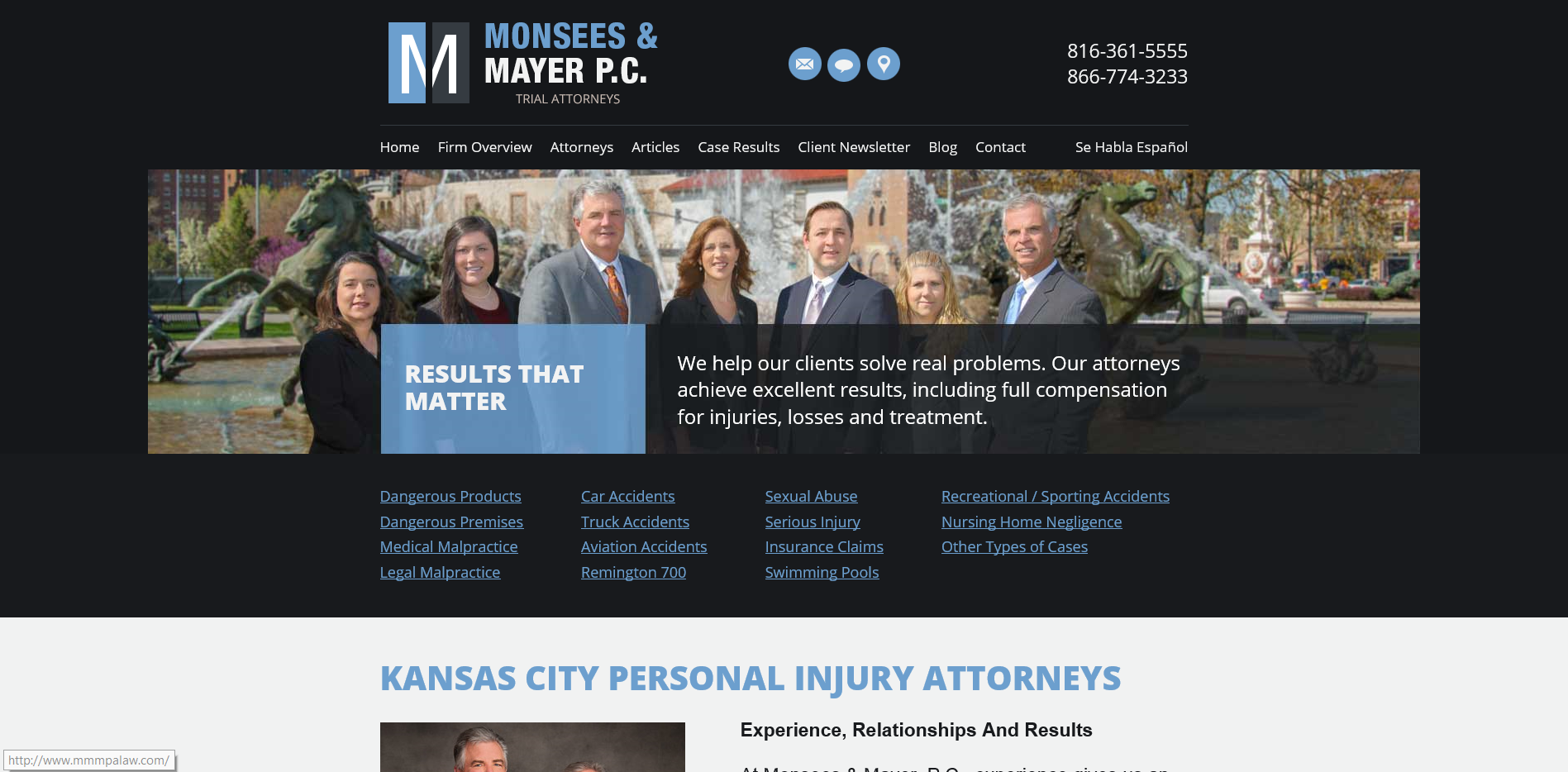
#4 www.mmmpalaw.com
FindLaw did a nice job here organizing a very content rich website. Use of wider screen layout and scrolling layout is a welcomed change from the number one legal design company in the Country. In the past most FindLaw sites tried to stuff everything above the fold including an obnoxious contact us form. This more modern style is consistent with studies that show people looking for legal help will actually read your content and will scroll down the page to access it!
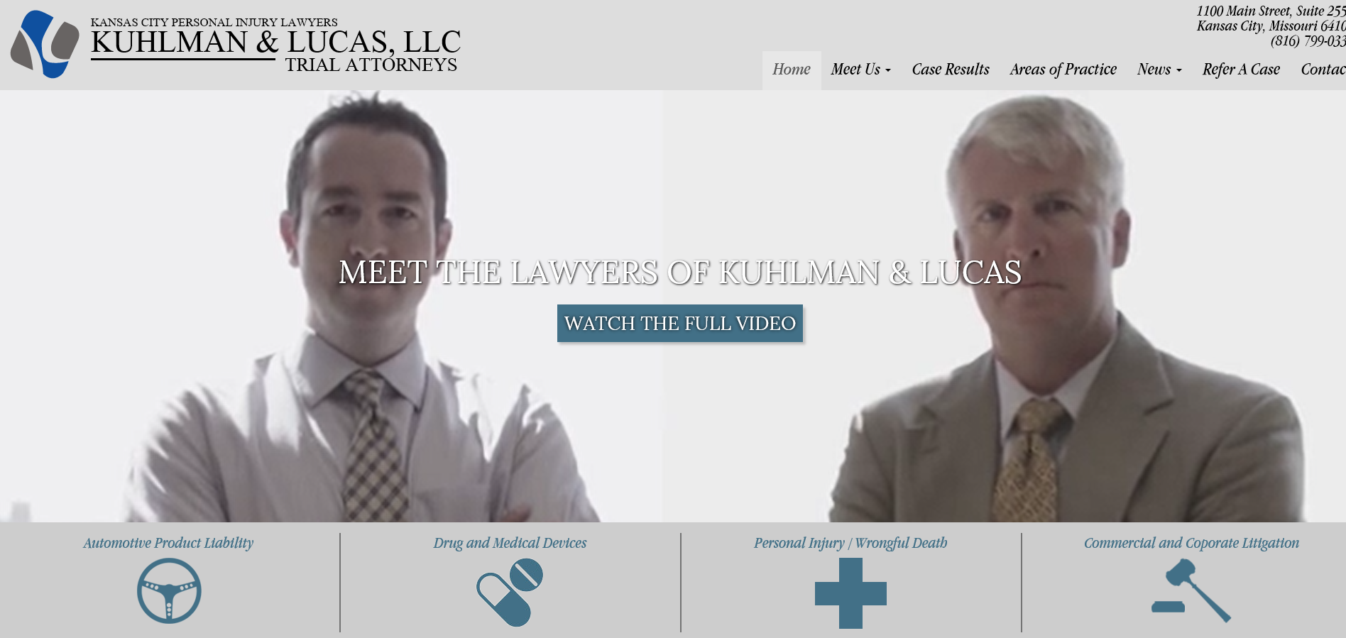
#5 http://kuhlmanlucas.com/
A very cool looking website. A full screen video takes up the entire space above the fold. One small complaint is that when the video ends – the screen reverts to a black screen. I would think they could program a picture to appear? The site has terrible visibility with no onsite optimization to speak of, but that may be on purpose considering how the video stresses their low volume, high quality referral practice.
Honorable Mention
www.wendtgoss.com – Fairly visible site that features the wide screen design with the more modern scrolling layout.
www.dh-law.com – Very modern looking design that uses the entire screen. Some cool interactive features are included
www.pophamlaw.com Very clean modern design. Utilizes a dusk skyline picture of Kansas City that is used by at least 7 other PI lawyers in Kansas City
www.bautistaallen.com – Very cool design that has good visibility for some important keywords. Nice use of Parallax scrolling
www.mayerrosenberg.com – Best FindLaw site in Kansas City
www.treypettlonlaw.com This was a ground breaking design when it came out 6 years ago. Still looks cool, but the narrow pixel size definitely makes it look dated.
www.wrightandfisher.com Nice looking Scorpion site with very poor visibility
www.doctorspracticinglaw.com Very clean, professional looking design.
**Did I miss a great site? Please send me your feedback. Thanks, Alex